
CSS June Roundup

I’ve been lucky enough to present at and help organise the local CSS meetup. This article is companion to a talk I gave showcasing some community updates and fun features either experimental or widely available in CSS!
If you just want to jump around to links see the high level recap below (best viewed with chrome to see all non baseline features). Please note the title link scrolls to the section and the external link will take you to the relevant page!
- MelbCSS Community Themes - External Link - The MelbCSS website has had a fresh paint job and is now ready to accept community theme submissions! Head on over to the GitHub to find out more.
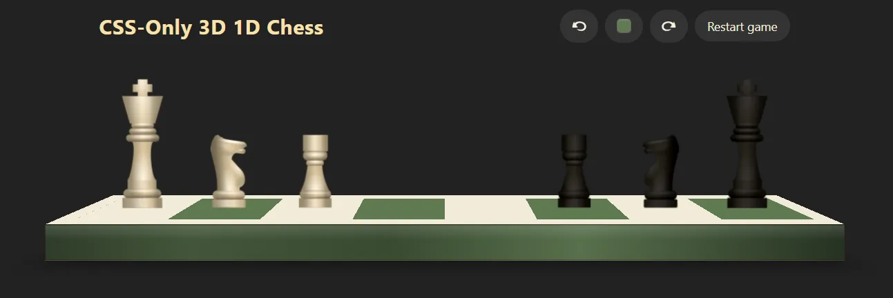
- CSS 1D Chess - External Link - David Sojevic One of our awesome community members put together a puzzle game demo and blog post inspired by a Hacker News article in which the player solves a Chess puzzle on one dimension. The project showcases what’s possible with only CSS and HTML - It even has a 3D toggle!
- corner-shape - External Link - A new property that specifies a box’s corners within the area specified by its border-radius property!
- random() - External Link - Brace yourself random() is coming. At the moment you can only test this feature in Safari.
- if() - External Link - The if() function is gaining traction, perhaps if() it’s ready soon conditional checkboxes are a thing of the past?
- Lazy Loading - External Link - A HTML Attribute that helps us manage the load time of a site, but can we also make it look good!
- Sprites - External Link - Using pixel art magic to have some fun!
MelbCSS Community Themes
Section titled “MelbCSS Community Themes”During the last few MelbCSS meetups we talked about putting together a neat little project to bring everyone together - I’m happy to announce it’s now ready!
The aim is to provide a canvas being the MelbCSS Website as a playground for CSS creativity. We have tried to make it accessible to contribute and CSS focused, using GitHub as the platform to help manage submissions and deployment.
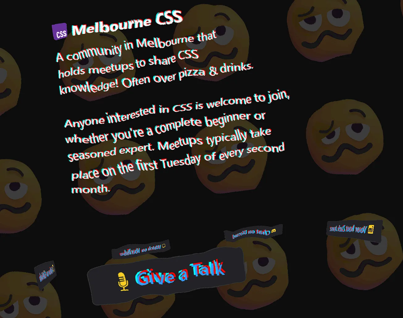
Our first official submission from Ronvoluted did not disappoint! Titled chaos the swirls of buttons and emojis certainly live up to Ron’s vision with some interesting SVG filter effects being used similar to ripples on a pond! - and of course it’s all CSS.
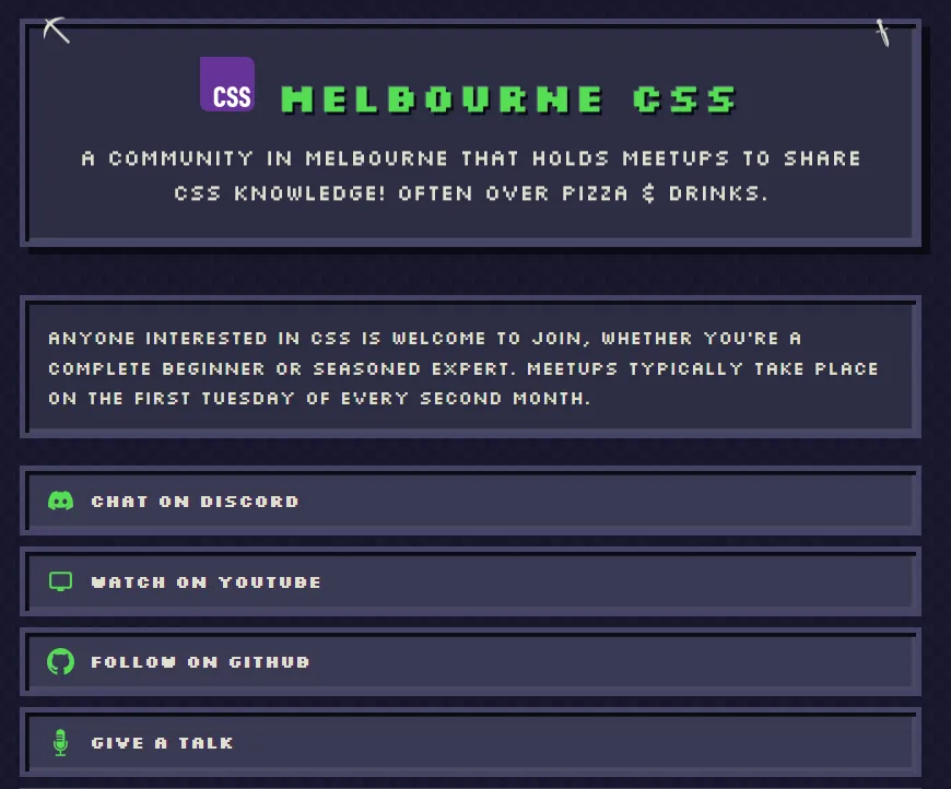
It’s been very exciting to see the pull requests coming in, as I was writing this piece up a new theme arrived! This one was from LakshmiChaitanya2008 titled Minecraft.
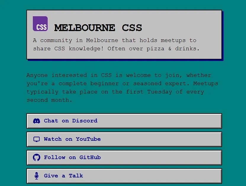
 As I had to test some features, I did put together a
 Retro theme which was a homage to old terminals and operating systems.
Check out the contributing guide to get started! We are more than happy to help answer any questions in the discord as well.
CSS 1D Chess
Section titled “CSS 1D Chess”Perched on a single-line board this mini game challenges the player to “win at chess” with the constraint. It’s ironic because the developer who made this David Sojevic has won at CSS with the constraint of not using JavaScript! There are some neat in action techniques here including the classic checkbox hack .
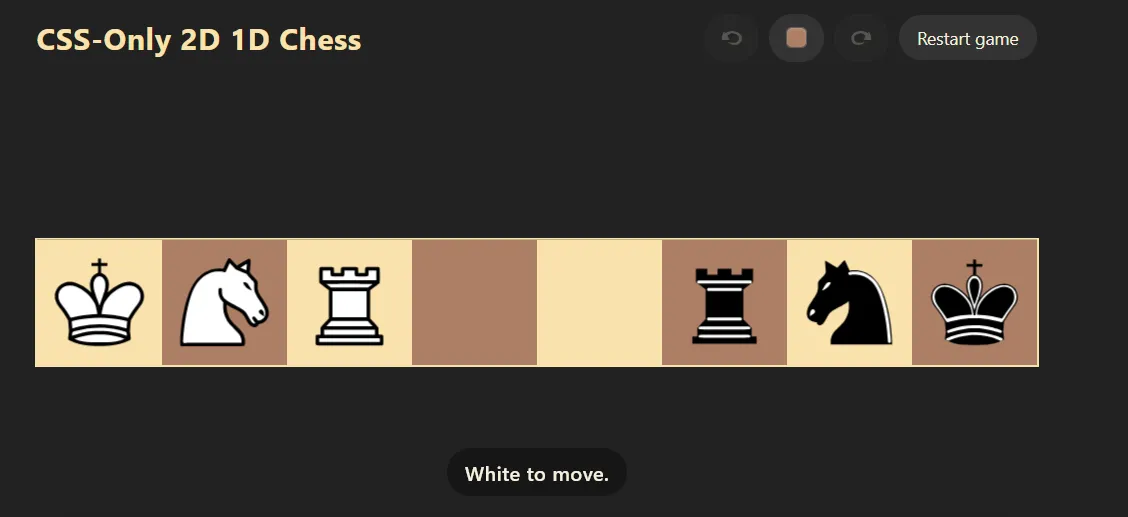 Without spoiling too much - there’s also a 3D Easter egg purely written in CSS. I highly recommend reading the full blog post on how its done - lots of great little techniques.
corner-shape
Section titled “corner-shape”If you have needed to style an element beyond a simple radius of a border you’ve probably reached up to grab the humble SVG. Whilst the SVG still sits in its rightful spot of extremely flexible but a pain to master, some new CSS flags might make our lives slightly easier in the not too distant future. Meet the corner-shape!
See the Pen corner-shape in action by dots (@dottys) on CodePen.
Unlike border-radius in which borders just curve the corner-shape property provides us with actual shapes to put into each corner! By manipulating the superellipse() value we are able to create some awesome corners in inverse or standard composition. The spec also has some keywords baked in allowing for you to quickly call values without guessing. As an example corner-shape: squircle;.
Below is a summary of the keywords available.
| Keyword | Value |
|---|---|
| square | superellipse(infinity) |
| squircle | superellipse(2) |
| round | superellipse(1) |
| bevel | superellipse(0) |
| scoop | superellipse(-1) |
| notch | superellipse(-infinity) |
random()
Section titled “random()”Computer scientists have been harping on about “true random numbers” for a while now. Whilst this isn’t necessarily a discussion about that I did want to add an interesting note for those interested. True randomness is observed through physical phenomena the famous “lava lamp wall” from Cloudflare is a great example of this.
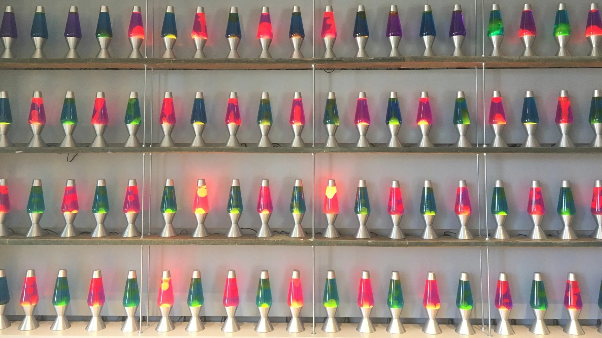
With that out of the way, It looks like CSS may be getting its very own random() function! I don’t believe many would dare to use it for cryptographic/security purposes but what it can do is add some fun ways to make a front end feel alive!
Whether it’s cycling through colours in a range or animating edges to randomly oscillate, I think it will open a world of creativity without needing to rely on additional JavaScript!
If you would like to test this feature it is currently only supported on the Safari browser.
The checkbox hack was a great way to bake some “logic” into the front end but what if() I told you (see what I did there), a new option is coming. The utility of an if statement in CSS will bring with it a host of functionality and standardisation previously obscured or reliant on frameworks/JavaScript.
One thing I’m really excited about is the ability to use single variables to conditionally update styling. This is a big win as it allows for more performant and easier to manage code that dynamically manages themes.
Lazy Loading
Section titled “Lazy Loading”With the loading attribute now baked into the HTML Spec there’s a fair amount of options available to make those skeletons pop! By combining the starting-style rule with a loading=“lazy” - there are some really neat ways to naturally transition in loading elements. Paired with an intersection observer things like infinite scroll and load time become less reliant on JavaScript!
The demo below gives a great example of what can be achieved (note - I am using JavaScript to randomly fetch 400 images to show the effect in real time!)
See the Pen Lazy Loading Demo by dots (@dottys) on CodePen.
Sprites
Section titled “Sprites”Earlier in the year I came across a beautifully written post from Josh w Comeau detailing the use of sprites and sprite sheets, it’s a great example of how web developers have always had neat little hacks and tricks web developers use to emulate functions we are familiar with. If you remember this UI.
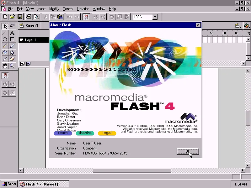
- Were getting old
- You would know the pain of putting one frame after another to make an animation.
I decided to get out asperite to make this funky little animation as an example!
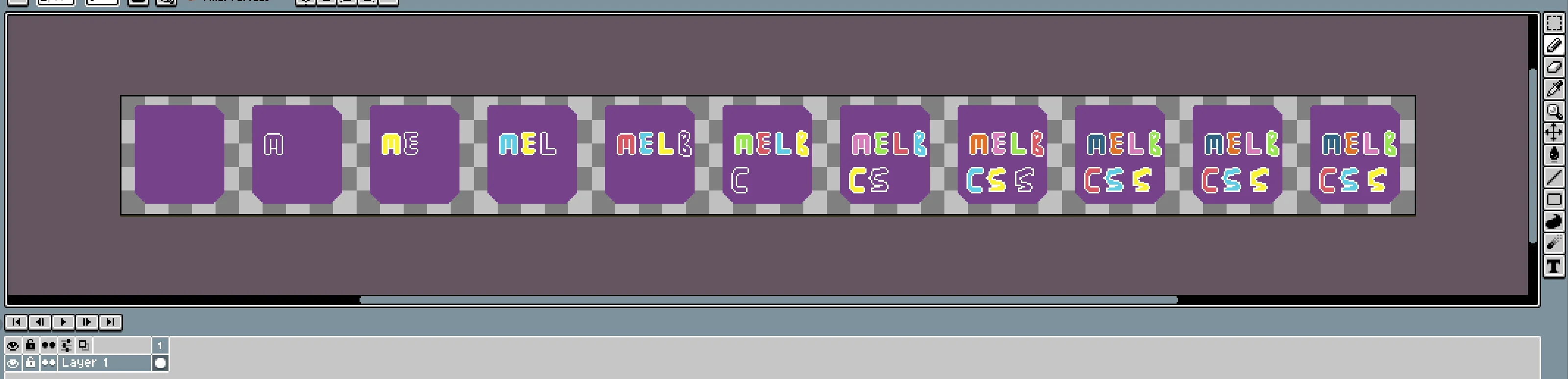

See the Pen Spritesheet Demo by dots (@dottys) on CodePen.
The linked article and external links in the TLDR have some examples of this but the premise is simple.
- Get yourself a sprite sheet.
- Use a cover div to effectively crop to your tile size, by setting the width and height to the sprite dimensions.
- Create a stepped animation function
sprite 1s steps(<number of frames>, jump-none) infinite; - Animate across or around your sprite sheet by manipulating either
object-positionorbackground-position’s from -> to.